Sass vs. SCSS: which syntax is better?

Since the creation of Sass nearly 5 years ago, it has been plagued by many levels of controversy. It billed itself as “a better CSS” and added brand new features unheard of to CSS authors such as variables, nesting and mixins. Sass also introduced an entirely different indentation-oriented syntax and a brand new perspective on how to author CSS.

The Sass syntax

The indented syntax of Sass was inherited from its first-born brother Haml. And while Sass and Haml once got along – Hey, they even shared the same Ruby Gem! – dissension in the family caused the two languages to split and go their separate ways. Each seeking its own fame and fortune in the land of Open Source opportunity.

One common objection among Sass detractors is that the indented syntax is so foreign to CSS. Why spend the time learning a language that is radically different from CSS? This difference, they fear, will make it hard for them to continue to remain fluent in a language with as many nuances and subtleties as CSS.

What if Sass is just a fad? What if it doesn’t last? What if it doesn’t gain traction among the masses? What if all their code and newly formed best practices fall by the wayside should the “downfalls” of Sass become a reality? What if … ah, you get the point.

And the objections trail on …

SCSS to the rescue!

In version 3 of Sass, the SCSS (Sassy CSS) syntax was introduced as “the new main syntax” for Sass and builds on the existing syntax of CSS. It uses brackets and semi-colons just like CSS. It doesn’t care about indentation levels or white-space.

In fact, Sass’s SCSS syntax is a superset of CSS – which means SCSS contains all the features of CSS, but has been expanded to include the features of Sass as well. In layman’s terms, any valid CSS is valid SCSS. And in the end, SCSS has the exact same features as the Sass syntax, minus the opinionated syntax.

Those who are new to Sass have less to learn. And as for Sass detractors, well, they can no longer complain about the syntax. As far as I’m concerned, SCSS is the new CSS.

Which syntax is better?

If you are an old hat at Sass, chances are you’ve got an opinion about which syntax is better. And there are a lot of good people on both sides of the aisle. Some prefer Sass, the original syntax – while others prefer SCSS. Either way, there’s no need for panic or worry because Sass’s indented syntax has not been and will never be deprecated!

I’m not even going to pretend to be unbiased in this debate. I myself am a huge fan of SCSS. A recent convert, actually. I was once a die-hard fan of the indented syntax, but I’ve changed my mind on the matter and I wrote this article to share why.

Before I get to that, let me explain the reasons I loved Sass, and why I almost didn’t give SCSS a chance.

Pros for Sass

Reason #1: The Sass syntax is more concise

It’s true. The indented syntax removes the need for semi-colons and braces. It doesn’t require that you use the verbose @include to mixin your mixins. Instead it uses the + operator which requires less typing and makes your code simpler, and easier to read.

Reason #2: The Sass syntax is easier to read

Because of its rules about indentation, it’s kind of hard to write unreadable Sass. Sass forces you to write your code the same way every time. There’s no option for venturing off and making your own style of commenting and formatting. It’s very strict on how things can be done. On large teams or in situations where you aren’t the sole author of all the code, this could be a huge plus. It forces the team into more strict coding practices (much like what XHTML did for HTML) and leaves little room for deviation from the beaten path.

Reason #3: The Sass syntax doesn’t complain about missing semi-colons

Ok, I know this probably belongs with reason #1, but I’m listing it separately because it was one of the major reasons I loved the original syntax. Not only did I not have to type semi-colons at the end of every attribute/value pair, but Sass ensured that my output always had the correct semi-colon placement. This is a huge win over writing vanilla CSS which doesn’t complain about semi-colons (but, the CSS validator does). When I wrote straight CSS I was always surprised by how many times a misplaced semi-colon was the reason a rule didn’t get applied properly.

This isn’t a points war

Now, before I get too far ahead of myself, I just want to say that this article isn’t a 3 points for Sass, 8 points for SCSS argument. Sure, I list more points for SCSS, but your feelings on each of the points are going to vary. For some, the three points I’ve stated above as pros for Sass will be persuasive enough to keep you using it. For many, switching back to something more like CSS after using Sass will seem like lunacy.

For me that’s exactly what it felt like the first time I tried to do a project in SCSS. The brackets and semi-colons were back. A lot of what I hated about CSS was back. It was like taking a step backwards instead of continuing to push forward (that’s the point right?).

In fact, like any good citizen of the Internet, I tweeted my hatred of SCSS. I had dipped my toes in the water and found it too chilly for my taste. So I hung up my curly-braces and semi-colons and went on my way. Sass was good enough for me just as it was, thank you very much. No need to revert back to the dark ages of CSS just to get a more familiar syntax.

A change of heart?

So, what changed my heart? To tell you the truth I’m not really sure. A lot of it for sure had to do with the fact that my good friend Brandon Mathis had recently made the switch to SCSS and felt it was better. Though he offered a couple of sound arguments, which I’ve reused below, Brandon really didn’t try to persuade me too much. Mainly, he just said that he had found he liked it better. It took him a while, of course, but he was much happier now that he had made the switch.

Now Brandon has probably written more Sass than almost anyone I know. He’s on the Compass core team and has been using Sass exclusively in his projects for over 4 years now. Needless to say, his opinion holds a lot of weight with me. Also, Chris Eppstein (the author of Compass) seems to prefer the SCSS syntax. He likes it so much, that he even rewrote all of Compass in it.

I was beginning to question my resolve. So on my next project, instead of giving it a half-hearted try for a day, I decided to go all in and code the whole project in SCSS to compare the difference. The outcome? I found that it took some getting used to (as expected), but I actually began to prefer the new SCSS syntax to the original Sass syntax.

Here’s why …

Pros for SCSS

Reason #1: SCSS is more expressive

No really! I know I argued above that Sass is easier to read because of the way it forces you to write your rules and attributes with indentation, but after coding for a while in SCSS I’ve realized that I really like having the option to put a couple of attribute/value pairs on the same line. I don’t always write it this way.

Normally, I write in expanded format with an attribute/value pair per line. But the compressed syntax is helpful when I only have an attribute/value pair or two. I especially like it for changing the color of a font for a hover state or adding an underline to a link.

For me SCSS ends up being more logically grouped than Sass. I can compress code that would take several lines in the Sass syntax into just a couple of lines of SCSS. Typically rules are grouped anyway. And when reading code, the number of lines of code that a bit of code uses tends to indicate its importance.

In SCSS I can compress lines that are fairly standard. And expand across several lines when I’m doing something complicated.

Reason #2: SCSS encourages proper nesting of rules

One of the huge advantages of Sass in general is that it allows you to nest selectors within selectors. This is awesome because when you change the “name” of an element, you only need to change it in one place (the outer selector) instead of in numerous places like you would when writing CSS.

But to quote Spiderman, with great power comes great responsibility.

And with the Sass syntax it really is true. It is too much power. At least for someone like me. Sass code I write tends to get too deeply nested. Why? Because it’s too easy to do. Every-time you nest something in Sass you need to be conscious of the impact that it is having on your output code.

Deeply nested Sass produces CSS with really long selectors. Especially if you use the comma operator at a high level (which is probably the most dangerous aspect of nesting). Not only is this bad because it increases the file size of the final CSS, too much specificity can become really hard to override in other rules. Importance is the result. You find yourself using !important in anger with fists in the air just to get a rule applied correctly.

Reason #3: SCSS encourages more modular code with @extend

Because nesting is harder in SCSS I find myself using @extend a lot more frequently. I tend to write code that is nested 1 – 2 levels deep underneath an abstract or virtual class name that is then extended by other selectors. Again, the curly braces, which are “ugly”, help me recognize when my code is too deeply nested and force me down the path of writing more modular code.

Oh, and if you’re not using the @extend directive, you are really missing out on the awesome-sauce of Sass! Experts agree. 🙂

Reason #4: SCSS allows me to write better inline documentation

It’s true that the Sass syntax allows a certain amount of flexibility with comments, but I find myself writing more inline-documentation directly in SCSS than Sass. A lot of this has to do with the way the code hangs together and the flexibility in syntax that SCSS provides. Braces help me group my code and comments in a way that makes more sense to me. I know we are talking aesthetics here, but more flexibility makes a difference when writing documentation.

Reason #5: Existing CSS tools often work with SCSS

I don’t actually use a lot of other tools with my CSS, but one area where this is particularly helpful is syntax highlighting. Depending on your editor preference, it may or may not have support for the indented Sass syntax. But most editors already have built-in support for CSS and tend to work well with SCSS. Also, if you do any blogging, most code highlighters support CSS, but only a handful support the Sass syntax.

Reason #6: Integration with an existing CSS codebase is much easier

I’ve often had to integrate with other CSS code when building a web site. It’s either code from some jQuery library I’m using, or a pre-existing CSS codebase. In the past I’ve often converted that code to Sass and lost valuable hours in the conversion process.

For a library, the downside is that it’s not code that you really want to maintain. When upgrading the library, the last thing you want to do is to go through the conversion process again. If it’s an existing codebase, it’s often much better to make smaller changes, than to jump into a megalithic refactoring process right away.

SCSS lets you use the existing code as is, and incrementally re-factor as you go along.

It’s true that with the indented syntax the sass-convert tool can get you most of the way there, but it’s never a completely clean conversion.

Reason #7: SCSS provides a much lower barrier to entry

From a Sass advocacy perspective, it’s much easier to convince someone to use SCSS than Sass. It’s easier to introduce them to a couple new concepts (SCSS) rather than an entirely new syntax. Designers can be very stubborn, caggy people. They are opinionated, and wary of change. They tend to do what they know well and while they do experiment with new things, experimentation with new technology is not built into the design community like it is for the programming community.

And don’t forget the other barriers to getting started with Sass. Right now you need to be familiar with the command prompt. At least enough to run a couple of commands. The command prompt is scary to the mouse-driven, button clicking designer.

Reason #8: SCSS could become the next version of CSS

Since its creation Sass and languages like it have attracted the attention of a lot of smart people. Some of those people are already thinking about adding some of the features that Sass introduced to CSS. It’s possible that the syntax introduced in SCSS could become CSS4!

Conclusion

I hope I’ve challenged you a little in your own perspective on both syntaxes. While I’m clearly arguing the advantages of the SCSS syntax, I’d also like to encourage you to go outside of your comfort zone and experiment a little more. If you’ve only been exposed to the SCSS syntax, perhaps you’d enjoy spending some time with the indented Sass syntax. And if you’re an original-flavor-only kinda person – a purist – you may benefit from giving the SCSS syntax a serious try.

As I said before, there are a lot of good people on both sides of the line in this debate. Feel free to express your own opinion in the comments below.

Editor’s Note

We’ve also setup a Wrangl to make sense of both sides of the argument.
SASS

SASS is css on steroids. I could say SASS is the natural evolution of CSS into a formal programming language and it falls somewhere in the middle.

Why use SASS?

  • Faster coding
    • mixin
  • Better organization
    • Nesting
    • @media
  • The ability to use math operators, variables, functions and control directives
  • Encoding
  • Output style

CSS Gradients

Just as you can declare the background of an element to be a solid color in CSS, you can also declare that background to be a gradient. Using gradients declared in CSS, rather using an actual image file, is better for control and performance. Gradients are typically one color that fades into another, but in CSS you can control every aspect of how that happens, from the direction to the colors (as many as you want) to where those color changes happen. Let’s go through it all.  

Gradients are background-image

While declaring the a solid color uses background-color property in CSS, gradients use background-image. This comes in useful in a few ways which we’ll get into later. The shorthand background property will know what you mean if you declare one or the other.
.gradient {

  /* can be treated like a fallback */
  background-color: red;

  /* will be "on top", if browser supports it */
  background-image: linear-gradient(red, orange);

  /* these will reset other properties, like background-position, but it does know what you mean */
  background: red;
  background: linear-gradient(red, orange);

}

Linear Gradient

Perhaps the most common and useful type of gradient is the linear-gradient(). The gradients “axis” can go from left-to-right, top-to-bottom, or at any angle you chose. Not declaring an angle will assume top-to-bottom:
.gradient {
  background-image:
    linear-gradient(
      red, #f06d06
    );
}
Those comma-separated colors can type of color you normally use: Hex, named colors, rgba, hsla, etc. To make it left-to-right, you pass an additional parameter at the beginning of the linear-gradient() function starting with the word “to”, indicating the direction, like “to right”:
.gradient {
  background-image:
    linear-gradient(
      to right, 
      red, #f06d06
    );
}
This “to” syntax works for corners as well. For instance if you wanted the axis of the gradient to start at the bottom left corner and go to the top right corner, you could say “to top right”:
.gradient {
  background-image:
    linear-gradient(
      to top right, 
      red, #f06d06
    );
}
If that box was square, the angle of that gradient would have been 45°, but since it’s not, it isn’t. If you wanted to make sure it was 45°, you could declare that:
.gradient {
  background-image:
    linear-gradient(
      45deg, 
      red, #f06d06
    );
}
You aren’t limited to just two colors either. In fact you can have as many comma-separated colors as you want. Here’s four:
.gradient {
  background-image:
    linear-gradient(
      to right, 
      red, 
      #f06d06, 
      rgb(255, 255, 0), 
      green
    );
}
You can also declare where you want any particular color to “start”. Those are called “color-stops”. Say you wanted yellow to take up the majority of the space, but red only a little bit in the beginning, you could make the yellow color-stop pretty early:
.gradient {
  height: 100px;
  background-color: red;
  background-image:
    linear-gradient(
      to right,
      red,
      yellow 10%
    );
}
We tend to think of gradients as fading colors, but if you have two color stops that are the same, you can make a solid color instantly change to another solid color. This can be useful for declaring a full-height background that simulates columns.
.columns-bg {
  background-image:
    linear-gradient(
      to right, 
      #fffdc2,
      #fffdc2 15%,
      #d7f0a2 15%,
      #d7f0a2 85%,
      #fffdc2 85%
    );
}

Browser Support / Prefixes

So far we’ve only looked at the new syntax, but CSS gradients have been around for quite a while. Browser support is good. Where it gets tricky is syntax and prefixing. There are three different syntaxes that browsers have supported. This isn’t what they are officially called, but you can think of it like:
  1. Old: original WebKit-only way, with stuff like from() and color-stop()
  2. Tweener: old angle system, e.g. “left”
  3. New: new angle system, e.g. “to right”
And then prefixing as well. Let’s try a chart:
Chrome1-9: Old, prefixed10-25: Tweener, prefixed26: New, unprefixed
Safari3-: No support4-5.0: Old, prefixed5.1-6.0: Tweener, prefixed 6.1: New, unprefixed
Firefox3.5-: No support3.6-15: Tweener, prefixed16: New, unprefixed
Opera11.0-: No support11.1-11.5: Tweener, prefixed, only linear11.6-12: Tweener, prefixed, added radial 12.1: Tweener, unprefixed 15: New, unprefixed
IE8-: No support9: filters only10+: New, unprefixed (also supports Tweener w/ prefix)
Android2.0-: No support2.1-3.0: Tweener, prefixed4.0-4.3: New, prefixed 4.4+: New, unprefixed
iOS3-: No support3.2-4.3: Tweener, prefixed5.0-6.1: New, prefixed 7.0: New, unprefixed
There is some overlap in there. For instance when a browser supports the New syntax they probably also support the older syntaxes as well, including the prefix. Best practice is: if it supports New, use New. So if you wanted to absolute deepest possible browser support, a linear gradient might look like this:
.gradient {
  
  /* Fallback (could use .jpg/.png alternatively) */
  background-color: red;

  /* SVG fallback for IE 9 (could be data URI, or could use filter) */
  background-image: url(fallback-gradient.svg); 

  /* Safari 4, Chrome 1-9, iOS 3.2-4.3, Android 2.1-3.0 */
  background-image:
    -webkit-gradient(linear, left top, right top, from(red), to(#f06d06));
  
  /* Safari 5.1, iOS 5.0-6.1, Chrome 10-25, Android 4.0-4.3 */
  background-image:
    -webkit-linear-gradient(left, red, #f06d06);

  /* Firefox 3.6 - 15 */
  background-image:
    -moz-linear-gradient(left, red, #f06d06);

  /* Opera 11.1 - 12 */
  background-image:
    -o-linear-gradient(left, red, #f06d06);

  /* Opera 15+, Chrome 25+, IE 10+, Firefox 16+, Safari 6.1+, iOS 7+, Android 4.4+ */
  background-image:
    linear-gradient(to right, red, #f06d06);

}
That’s an awful lot of code there. Doing it by hand would be error-prone and a lot of work. Autoprefixer does a good job with it, allowing you to trim that amount of code back as you decide what browsers to support. The Compass mixin can do SVG data URI’s for IE 9 if that’s important to you. To complicate things just a little more, the way degrees work in the OLD vs NEW syntax is a bit different. The OLD (and TWEENER – usually prefixed) way defines 0deg and left-to-right and proceeds counter-clockwise, while the NEW (usually unprefixed) way defines 0deg as bottom-to-top and proceeds clockwise. OLD (or TWEENER) = (450 – new) % 360 or even simpler: NEW = 90 – OLD OLD = 90 – NEW like: OLD linear-gradient(135deg, red, blue) NEW linear-gradient(315deg, red, blue)

IE filters

Internet Explorer (IE) 6-9, while they don’t support the CSS gradient syntax, do offer a programmatic way to do background gradients
/* "Invalid", but works in 6-8 */
filter: progid:DXImageTransform.Microsoft.gradient(GradientType=0, startColorstr=#1471da, endColorstr=#1C85FB);

/* Valid, works in 8-9 */
-ms-filter: "progid:DXImageTransform.Microsoft.gradient (GradientType=0, startColorstr=#1471da, endColorstr=#1C85FB)";
There are some considerations here on deciding to use this or not:
  1. filter is generally considered a bad practice for performance,
  2. background-image overrides filter, so if you need to use that for a fallback, filters are out. If a solid color is an acceptable fallback (background-color), filter is a possibility
Even though filters only work with hex values, you can still get alpha transparency by prefacing the hex value with the amount of transparency from 00 (0%) to FF (100%). Example: rgba(92,47,90,1) == #FF5C2F5A rgba(92,47,90,0) == #005C2F5A

Radial Gradients

Radial gradient differ from linear in that they start at a single point and emanate outwards. Gradients are often used to simulate a lighting, which as we know isn’t always straight, so they can be useful to make a gradient seem even more natural. The default is for the first color to start in the (center center) of the element and fade to the end color toward the edge of the element. The fade happens at an equal rate no matter which direction.
.gradient {
  background-image:
    radial-gradient(
      yellow,
      #f06d06
    );
}
You can see how that gradient makes an elliptical shape, since the element is not a square. That is the default (ellipse, as the first parameter), but if we say we want a circle we can force it to be so:
.gradient {
  background-image:
    radial-gradient(
      circle,
      yellow,
      #f06d06
    );
}
Notice the gradient is circular, but only fades all the way to the ending color along the farthest edge. If we needed that circle to be entirely within the element, we could ensure that by specifying we want the fade to end by the “closest-side” as a space-separated value from the shape, like:
.gradient {
  background-image:
    radial-gradient(
      circle closest-side,
      yellow,
      #f06d06
    );
}
The possible values there are: closest-corner, closest-side, farthest-corner, farthest-side. You can think of it like: “I want this radial gradient to fade from the center point to the __________, and everywhere else fills in to accommodate that.” A radial gradient doesn’t have to start at the default center either, you can specify a certain point by using “at ______” as part of the first parameter, like:
.gradient {
  background-image:
    radial-gradient(
      circle at top right,
      yellow,
      #f06d06
    );
}
I’ll make it more obvious here by making the example a square and adjusting a color-stop:

Browser Support

It’s largely the same as linear-gradient(), except a very old version of Opera, right when they started supporting gradients, only did linear and not radial. But similar to linear, radial-gradient() has gone through some syntax changes. There is, again: “Old”, “Tweener”, and “New”.
/* Example of Old */
background-image: 
  -webkit-gradient(radial, center center, 0, center center, 141, from(black), to(white), color-stop(25%, blue), color-stop(40%, green), color-stop(60%, red), color-stop(80%, purple));

/* Example of Tweener */
background-image: 
  -webkit-radial-gradient(45px 45px, farthest-corner, #F00 0%, #00F 100%) repeat scroll 0% 0% rgba(0, 0, 0, 0);

/* Example of New */
background-image: 
  radial-gradient(circle farthest-side at right, #00F, #FFF);
The hallmarks being:
  • Old: Prefixed with -webkit-, stuff like from() and color-stop()
  • Tweener: First param was location of center. That will completely break now in browsers that support new syntax unprefixed, so make sure any tweener syntax is prefixed.
  • New: Verbose first param, like “circle closest-corner at top right”
Again, I’d let Autoprefixer handle this. You write in the newest syntax, it does fallbacks. Radial gradients are more mind-bending than linear, so I’d recommend attempting to just get comfortable with the newest syntax and going with that (and if necessary, forget what you know about older syntaxes).

Repeating Gradients

With ever-so-slightly less browser support are repeating gradients. They come in both linear and radial varieties. There is a trick, with non-repeating gradients, to create the gradient in such a way that if it was a little tiny rectangle, it would line up with other little tiny rectangle versions of itself to create a repeating pattern. So essentially create that gradient and set the background-size to make that little tiny rectangle. That made it easy to make stripes, which you could then rotate or whatever. With repeating-linear-gradient(), you don’t have to resort to that trickery. The size of the gradient is determined by the final color stop. If that’s at 20px, the size of the gradient (which then repeats) is a 20px by 20px square.
.repeat {
  background-image: 
    repeating-linear-gradient(
      45deg,
      yellow,
      yellow 10px,
      red 10px,
      red 20px /* determines size */
    );
}
Same with radial:
.repeat {
  background: 
    repeating-radial-gradient(
      circle at 0 0, 
      #eee,
      #ccc 50px
    );
}

Improper Fallback Loading

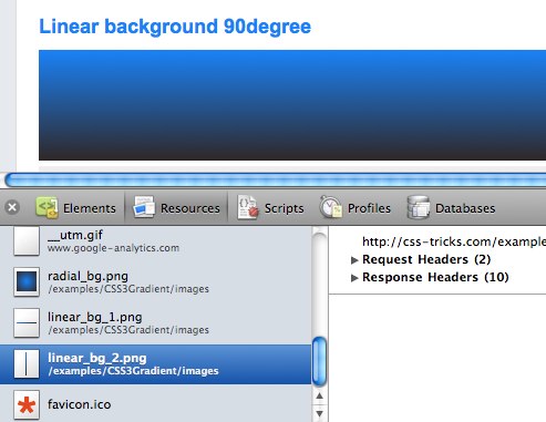
As we’ve covered, some really old browsers don’t support any CSS gradient syntax at all. If you need a fallback that is still a gradient, an image (.jpg / .png) could do the trick. The scary part with that is that some slightly-less-old browsers, that were just starting to support CSS gradients, would load the fallback image. As in, make the HTTP request for the image even though it would render the CSS gradient. Firefox 3.5.8 did this (see screenshot), as well as Chrome 5- and Safari 5.0.1. See:
Safari 5.0.1 loading fallbacks improperly
The good news is this isn’t really any issue anymore. The only offending browsers were Chrome and Safari and Chrome hasn’t done it since 6 and Safari hasn’t done it as of 5.1, going on three years ago.

Additional Resources

Update Node.js Version

I was recently installing a utility via NPM when I learned that my version of Node.js itself was out of date.  No worries — simply upgrade my Node.js install and move forward.  Of course I could just hit nodejs.org and get the new image, but figured there had to be an easier way.  It turns out there is — you can upgrade your local Node.js with NPM:
sudo npm cache clean -f
sudo npm install -g n
sudo n stable
The n package represents a Node helper, and running the last command upgrades node to the latest stable version.  Instead of using “stable”, you could specify a desired version:
sudo n 0.8.21
Once your install is complete, you can confirm you version with another command:
node -v
It’s quite nice that you can upgrade Node.js right from npm;  it’s like Inception…or something.

An Introduction to the `fr` CSS unit

An Introduction to the `fr` CSS unit

Avatar of Robin Rendle
Robin Rendle on (Updated on )
DigitalOcean provides cloud products for every stage of your journey. Get started with $200 in free credit!
With all the excitement around CSS Grid, I haven’t seen as much talk about the new fr CSS length unit (here’s the spec). And now that browser support is rapidly improving for this feature, I think this is the time to explore how it can be used in conjunction with our fancy new layout engine because there are a number of benefits when using it; more legible and maintainable code being the primary reasons for making the switch.   To get started, let’s take a look at how we’d typically think of building a grid in CSS. In the example below, we’re creating a four column grid where each column has an equal width:
<div class="grid">
<div class="column"> </div>
</div>
.grid {
  display: grid;
  grid-template-columns: repeat(4, 25%);
  grid-column-gap: 10px;
}
If you’ve never seen that repeat() function after the grid-template-columns property then let me introduce you to one of the neatest features of CSS Grid! It’s a shorthand, essentially, allow us to more succinctly describe repeating values. We could have written grid-template-columns: 25% 25% 25% 25%; instead, but it’s cleaner using repeat(), particularly when you have more verbose widths (like a minmax() expression). The syntax is essentially this:
repeat(number of columns/rows, the column width we want);
There are actually a couple of issues with what we’ve done so far, though. First, in order to use this neat CSS function, we had to do a tiny bit of math. We had to think to ourselves what is the total width of the grid (100%) divided by the number of columns we want (4), which brings us to 25%. In this instance, the math is pretty darn easy so we don’t have to worry about it but in more complex examples we can completely avoid doing the math and let the browser figure that out for us. We do have calc() available to us, so we could have done repeat(4, calc(100% / 4), but even that’s a little weird, and there is another problem anyway… The second issue is a problem with overflow. Because we’ve set each column to 25% and a grid-column-gap to 10px then that pushes grid element wider than 100%. It isn’t how you’d expect things to work from just looking at the code above but that’s how percentages work. What we’re really saying with the code above is “set each column to 25% the width of the viewport and have a 10px gap between them.” It’s a subtle difference, but it causes a big issue with layout. We’ve inadvertently caused some horizontal scrolling here:
This is where the fr unit can help us. The fr unit (a “fraction”) can be used when defining grids like any other CSS length such as %, px or em. Let’s quickly refactor the code above to use this peculiar new value:
.grid {
  display: grid;
  grid-template-columns: repeat(4, 1fr);
  grid-column-gap: 10px;
}
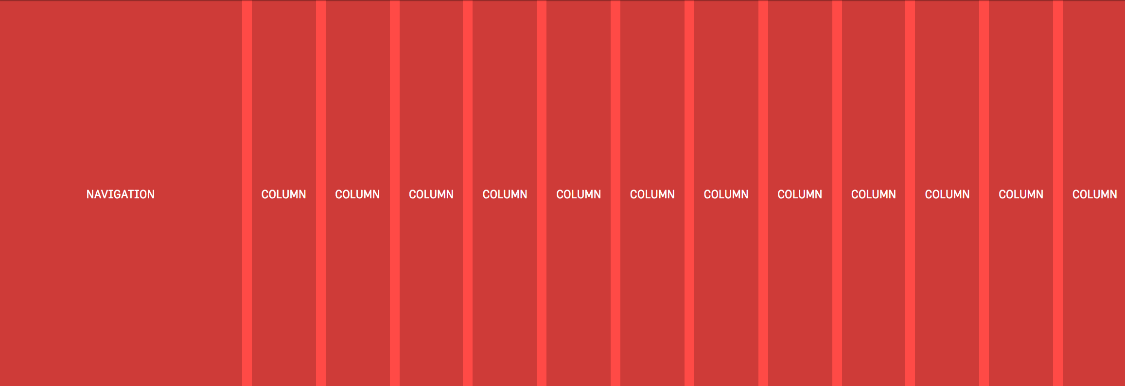
That will look just the same as the example above because in this instance we’re setting each of our four columns to one fraction (which happens to be 1/4 or 25%). But! There’s no overflow on the x-axis anymore because setting each column to 1fr takes that 10px into account automatically and subtracts it from the total width available for each column. Why the heck should I learn how to use this fancy new CSS length if I can mostly stick to the units like percent or pixels, you wonder? Well, let’s dig into a more complex CSS Grid example to explain why fr is a better alternative. In a new example, let’s say we want our navigation on the left followed by a twelve column grid which should look like this:
This is a pretty typical scenario for a lot of UIs and so using the fr unit prevents us from either making a separate grid div or fumbling about with calc. Because if we didn’t use fr in the example above then we’d somehow have to figure out the following:
the width of each column = ((width of viewport - width of nav) / number of columns) * 1%
That’s possible for sure, it’s just awfully painful to read, and if we changed the width of the nav then we’d have to do that dumb calculation all over again. Instead, the fr unit tidies all of that up into a super readable line of code:
.grid {
  display: grid;
  grid-template-columns: 250px repeat(12, 1fr);
  grid-column-gap: 10px;
}
What we’re doing here is setting a fixed width in pixels for the first column and then creating twelve separate columns which are set at one “fraction of the free space” (literally how the spec phrases it). But there’s no crazy calculations or anything! It’s super readable and if the width of that left nav changes then the width of our columns on the right will adjust themselves automatically. With just a little bit of legwork we’ve made our interface more maintainable for the future and we’ve ensured that our code is more legible for the next developers that are coming up behind us.

Information from other folks

Some of the fun and power of the fr unit comes from mixing it with other units. Imagine a fixed sidebar and main content area that takes up the rest of the space: grid-template-columns: 200px 1fr; easy! Here’s an example from DigitalOcean showing mixed units nicely:

Rachel Andrew has a video specifically about fr:

Anna Monus has a very good article on fr.

Yay for the fr unit!

6 CSS snippets every front-end developer should know in 2023

6 CSS snippets every front-end developer should know in 2023

Toolbelt worthy, powerful, and stable CSS you can use today.

I believe every front-end developer should know how to use container queries, create a scroll snap experience, avoid position: absolute with grid, swiftly hammer out a circle, use cascade layers, and reach more with less via logical properties. Here’s a quick overview of each of those expectations.

1. A container query #

The top requested CSS feature for 10 years straight, is now stable across browsers and available for you to use for width queries in 2023.

.panel {
container: layers-panel / inline-size;
}

.card {
padding: 1rem;
}

@container layers-panel (min-width: 20rem) {
.card {
padding: 2rem;
}
}
@container
Browser support
  • chrome 105, Supported 105
  • firefox 110, Supported 110
  • edge 105, Supported 105
  • safari 16, Supported 16
Source
container
Browser support
  • chrome 105, Supported 105
  • firefox 110, Supported 110
  • edge 105, Supported 105
  • safari 16, Supported 16
Source

2. Scroll snap #

Well orchestrated scroll experiences set your experience apart from the rest, and scroll snap is the perfect way to match system scroll UX while providing meaningful stopping points.

.snaps {
overflow-x: scroll;
scroll-snap-type: x mandatory;
overscroll-behavior-x: contain;
}

.snap-target {
scroll-snap-align: center;
}

.snap-force-stop {
scroll-snap-stop: always;
}

Learn more about the potential of this CSS feature in this huge and inspiring Codepen collection of around 25 demos.

scroll-snap-type
Browser support
  • chrome 69, Supported 69
  • firefox 99, Supported 99
  • edge 79, Supported 79
  • safari 11, Supported 11
Source
scroll-snap-align
Browser support
  • chrome 69, Supported 69
  • firefox 68, Supported 68
  • edge 79, Supported 79
  • safari 11, Supported 11
Source
scroll-snap-stop
Browser support
  • chrome 75, Supported 75
  • firefox 103, Supported 103
  • edge 79, Supported 79
  • safari 15, Supported 15
Source
overscroll-behavior
Browser support
  • chrome 63, Supported 63
  • firefox 59, Supported 59
  • edge 18, Supported 18
  • safari 16, Supported 16
Source

3. Grid pile #

Avoid position absolute with a single cell CSS grid. Once they’re piled on top of each other, use justify and align properties to position them.

.pile {
display: grid;
place-content: center;
}

.pile > * {
grid-area: 1/1;
}
grid
Browser support
  • chrome 57, Supported 57
  • firefox 52, Supported 52
  • edge 16, Supported 16
  • safari 10.1, Supported 10.1
Source

4. Quick circle #

There are lots of ways to make circles in CSS, but this is definitely the most minimal.

.circle {
inline-size: 25ch;
aspect-ratio: 1;
border-radius: 50%;
}
aspect-ratio
Browser support
  • chrome 88, Supported 88
  • firefox 89, Supported 89
  • edge 88, Supported 88
  • safari 15, Supported 15
Source

5. Control variants with @layer #

Cascade layers can help insert variants discovered or created later, into the right place in the cascade with the original set of variants.

/* file buttons.css */
@layer components.buttons {
.btn.primary {

}
}

Then, in some entirely different file, loaded at some other random time, append a new variant to the button layer as if it was there with the rest of them this whole time.

/* file video-player.css */
@layer components.buttons {
.btn.player-icon {

}
}
@layer
Browser support
  • chrome 99, Supported 99
  • firefox 97, Supported 97
  • edge 99, Supported 99
  • safari 15.4, Supported 15.4
Source

6. Memorize less and reach more with logical properties #

Memorize this one new box model and never have to worry about changing left and right padding or margin for international writing modes and document directions again. Adjust your styles from physical properties to logical ones like padding-inline, margin-inline, inset-inline, and now the browser will do the adjusting work.

button {
padding-inline: 2ch;
padding-block: 1ch;
}

article > p {
text-align: start;
margin-block: 2ch;
}

.something::before {
inset-inline: auto 0;
}
padding-inline
Browser support
  • chrome 87, Supported 87
  • firefox 66, Supported 66
  • edge 87, Supported 87
  • safari 14.1, Supported 14.1
Source
margin-block
Browser support
  • chrome 87, Supported 87
  • firefox 66, Supported 66
  • edge 87, Supported 87
  • safari 14.1, Supported 14.1
Source
inset-inline
Browser support
  • chrome 87, Supported 87
  • firefox 63, Supported 63
  • edge 87, Supported 87
  • safari 14.1, Supported 14.1
Source
Last updated: Improve article

BEM Front-End Methodology

Introduction to BEM

In web development, especially for smaller sites, organizing CSS styles may seem trivial. However, as projects scale and become more complex, effective CSS organization becomes crucial. It not only influences the speed of development but also impacts the maintainability of code and the overall performance of web applications. This challenge is exacerbated in larger teams where collaboration is key and in long-term projects that might involve legacy code. To address these concerns, various methodologies have emerged, with BEM (Block, Element, Modifier) being one of the most effective for maintaining clarity and structure in CSS.

Methodologies in CSS

Several methodologies aim to streamline CSS management, particularly in large projects. Some notable approaches include:

  • OOCSS (Object-Oriented CSS): This methodology emphasizes the separation of structure and skin, focusing on reusability by creating objects that can be styled independently.
  • SMACSS (Scalable and Modular Architecture for CSS): SMACSS categorizes styles into five different types, encouraging a systematic approach to writing CSS that is modular and scalable.
  • SUITCSS: This approach emphasizes structured naming conventions for class names and clear relationships among styles.
  • Atomic CSS: It breaks styles into the smallest possible components, promoting high reusability and efficiency.

Among these methodologies, BEM stands out due to its simplicity and effectiveness in fostering a clear understanding of component relationships within the markup.

BEM: Blocks, Elements, and Modifiers

BEM consists of three main components: Blocks, Elements, and Modifiers.

  1. Block: This is a standalone entity that represents a meaningful component of the UI. Examples include header, menu, and form.
  2. Element: An element is a part of a block that does not hold meaning on its own but is semantically linked to its block. For instance, menu__item or form__input.
  3. Modifier: A modifier is a flag that alters the appearance or behavior of a block or element. For instance, button--disabled or card--highlighted.

This structured naming convention allows developers to quickly grasp the relationship between HTML and CSS, enabling easier navigation and understanding of styles.

Implementing BEM

To illustrate how BEM works, let’s consider a button example:


<button class="button">
Normal button
</button>
<button class="button button--state-success">
Success button
</button>
<button class="button button--state-danger">
Danger button
</button>

Here, .button is the block, while .button--state-success and .button--state-danger are modifiers that define different states of the button.

Correspondingly, the CSS would look like this:

.button {
display: inline-block;
border-radius: 3px;
padding: 7px 12px;
border: 1px solid #D5D5D5;
background-image: linear-gradient(#EEE, #DDD);
font: 700 13px/18px Helvetica, Arial;
}

.button--state-success {
color: #FFF;
background: #569E3D linear-gradient(#79D858, #569E3D) repeat-x;
border-color: #4A993E;
}

.button--state-danger {
color: #900;
}

Benefits of BEM

BEM provides several advantages:

  • Modularity: Styles defined within a block are independent of other styles, preventing conflicts that arise from CSS cascading. This independence allows for blocks to be reused across different projects without modification.
  • Reusability: By constructing independent blocks and using modifiers, developers can mix and match styles, significantly reducing the volume of CSS code that needs to be maintained. This leads to a more efficient development process and easier updates in the future.
  • Structured Code: The clear structure provided by BEM enhances code readability and maintainability. It becomes easier for team members to navigate and understand styles, improving collaboration.

BEM in Practice

When employing BEM, developers gain a predictable structure that enhances team communication. Each component is self-describing, meaning that even without extensive CSS knowledge, a developer can infer the function of various classes. This shared language fosters collaboration and reduces the onboarding time for new team members.

Moreover, BEM addresses the issue of specificity in CSS. By adhering to its principles, developers avoid deeply nested selectors that complicate stylesheets. Instead, they can maintain a flatter specificity, which simplifies overriding styles when necessary.

Challenges and Criticism

While BEM offers many benefits, it is not without criticism. Some developers find the double underscores and double dashes cumbersome, preferring alternative naming conventions. Others argue that the verbosity of class names can lead to bloated HTML and CSS files.

Furthermore, some practitioners argue that adhering strictly to BEM can stifle creativity or flexibility in design. However, these concerns often stem from misunderstandings about the methodology itself. BEM is intended to provide a framework, not a rigid set of rules that must be followed at all costs.

Conclusion

In summary, BEM is a powerful methodology for organizing CSS that fosters clarity, modularity, and collaboration. By clearly defining blocks, elements, and modifiers, BEM helps developers understand the relationships within their code, which is crucial for maintaining large and complex stylesheets. While it may not resolve every challenge in CSS development, it provides a solid foundation for creating scalable, maintainable, and efficient styles. As web development continues to evolve, adopting methodologies like BEM can significantly enhance the development process, ensuring that teams can work effectively and efficiently together.

Foundation Zurb and the WordPress Comment Summit Button

For the last couple of weeks, I have been working on a theme using WordPress, Genesis and Foundation Zurb. Foundation is a front-end framework for rapid prototyping. Meaning? It is a large array of tools that make most of look that much cooler and way faster to code. However, mixing these 3 awesome tools into one single project  didn’t come without its headaches. One of the major problems I have encountered so far is to be able to match preexisting CSS styles in Foundation with WordPress. I could go about it in in two different ways. First, by using WordPress filters which will get cumbersome really quickly, as you would need to write functions to modify class names for each and every HTML element I target in my project. However, if you decide to go this route despite to be time consuming, I would need to also be aware that for some HTML elements there are no filters available. Meaning? you won’t be able to edit those elements, directly as of WordPress core developers didn’t see the need for users to be able to customize those elements to that extend. Take for example the comment submit button:
<input name="submit" type="submit" id="submit" class="submit" value="Post Comment">
At the time of this writing, there is no available filter to modify the class attribute for the comment submit button. There are ways around it, though. For example, adding a custom submit button and hiding the original WordPress button using CSS. However, this enters in the realm of hacking WordPress more than anything else, so I won’t be covering it in this post. While doing research on this topic, I found a ticket for WordPress core developers working on the comment button issue. This ticket was finally closed 3 months ago and it only took them 3 years, to come to a solution YAY!. However, the concept behind the issue was somehow lost during the entire process. The WordPress core developers added a class  named “submit” to the button and no way for users to customize the class name; so the problem still remains.

OOCSS and the Comment Submit Button

Styling the comment button using its class name as opposed to its ID allows front-end developers to separate content from its container which is one of basic principles of OOCSS. This is kind of the way front-end developers are going right now. However, this is an Issue that WordPress don’t seem too concerned about. Take for example that submit button inside the comment section. According with WordPress core developers if we choose to style that specific button, well, we will need to use its ID:
#submit{
  display:inline-block;
  zoom:1;
  vertical-align:bottom;
  text-align:center;
  margin:10px 5px;
  border-radius:3px;
  text-decoration:none;
  font-weight:900;
  font-family:'Helvetica Neue', Helvetica, Arial, sans-serif;
  text-shadow:0 1px 1px rgba(0,0,0,0.5);
  box-shadow:0 1px 3px rgba(0,0,0,0.3),inset 0 1px 0 rgba(250,250,250,0.4);
  -webkit-box-shadow:0 1px 3px rgba(0,0,0,0.3),inset 0 1px 0 rgba(250,250,250,0.4);
  -moz-box-shadow:0 1px 3px rgba(0,0,0,0.3),inset 0 1px 0 rgba(250,250,250,0.4);
  color:#FFF;
  border:1px solid #0082BE;
  background:#00A4EF;
  background-image:linear-gradient(bottom, rgb(0,163,239) 1%, rgb(0,177,241) 51%);
  background-image:-o-linear-gradient(bottom, rgb(0,163,239) 1%, rgb(0,177,241) 51%);
  background-image:-moz-linear-gradient(bottom, rgb(0,163,239) 1%, rgb(0,177,241) 51%);
  background-image:-webkit-linear-gradient(bottom, rgb(0,163,239) 1%, rgb(0,177,241) 51%);
  background-image:-ms-linear-gradient(bottom, rgb(0,163,239) 1%, rgb(0,177,241) 51%);
  font-size:13px;
  padding:5px 20px; 
}
But, what happens if we need another identical looking button somewhere else in the page? Well, according to WordPress you just need to target that button by its ID, as well:
#button-footer {
  display:inline-block;
  zoom:1;
  vertical-align:bottom;
  text-align:center;
  margin:10px 5px;
  border-radius:3px;
  text-decoration:none;
  font-weight:900;
  font-family:'Helvetica Neue', Helvetica, Arial, sans-serif;
  text-shadow:0 1px 1px rgba(0,0,0,0.5);
  box-shadow:0 1px 3px rgba(0,0,0,0.3),inset 0 1px 0 rgba(250,250,250,0.4);
  -webkit-box-shadow:0 1px 3px rgba(0,0,0,0.3),inset 0 1px 0 rgba(250,250,250,0.4);
  -moz-box-shadow:0 1px 3px rgba(0,0,0,0.3),inset 0 1px 0 rgba(250,250,250,0.4);
  color:#FFF;
  border:1px solid #0082BE;
  background:#00A4EF;
  background-image:linear-gradient(bottom, rgb(0,163,239) 1%, rgb(0,177,241) 51%);
  background-image:-o-linear-gradient(bottom, rgb(0,163,239) 1%, rgb(0,177,241) 51%);
  background-image:-moz-linear-gradient(bottom, rgb(0,163,239) 1%, rgb(0,177,241) 51%);
  background-image:-webkit-linear-gradient(bottom, rgb(0,163,239) 1%, rgb(0,177,241) 51%);
  background-image:-ms-linear-gradient(bottom, rgb(0,163,239) 1%, rgb(0,177,241) 51%);
  font-size:13px;
  padding:5px 20px;
}
Here, we have redundant code that will contribute to having a final “bloated” CSS file. How could fix this? The first step would be to replace the ID selectors for class names, which will allow us to create reusable code throughout our project. Secondly, separating structure, skin and content.

Structure

.custom-button{
  display:inline-block;
  zoom:1;
  vertical-align:bottom;
  text-align:center;
  margin:10px 5px;
  border-radius:3px;
  text-decoration:none;
  font-weight:900;
  font-family:'Helvetica Neue', Helvetica, Arial, sans-serif;
  text-shadow:0 1px 1px rgba(0,0,0,0.5);
  box-shadow:0 1px 3px rgba(0,0,0,0.3),inset 0 1px 0 rgba(250,250,250,0.4);
  -webkit-box-shadow:0 1px 3px rgba(0,0,0,0.3),inset 0 1px 0 rgba(250,250,250,0.4);
  -moz-box-shadow:0 1px 3px rgba(0,0,0,0.3),inset 0 1px 0 rgba(250,250,250,0.4);
}

Skin

.custom-button-blue {
  color:#FFF;
  border:1px solid #0082BE;
  background:#00A4EF;
  background-image:linear-gradient(bottom, rgb(0,163,239) 1%, rgb(0,177,241) 51%);
  background-image:-o-linear-gradient(bottom, rgb(0,163,239) 1%, rgb(0,177,241) 51%);
  background-image:-moz-linear-gradient(bottom, rgb(0,163,239) 1%, rgb(0,177,241) 51%);
  background-image:-webkit-linear-gradient(bottom, rgb(0,163,239) 1%, rgb(0,177,241) 51%);
  background-image:-ms-linear-gradient(bottom, rgb(0,163,239) 1%, rgb(0,177,241) 51%);
}

Content

.custom-button-small {
  font-size:13px;
  padding:5px 20px;
}
and this is how we will apply these class selectors if we would have had access to customize the class name for the comment submit button in our WordPress project:
<input name="submit" type="submit" id="submit" class="button button-blue button-small" value="Post Comment">
Now, Foundation comes with several classes that deal with buttons. The most basic of these selectors is the “button” class. All you need to do is match the style selector to the CSS class of the button. However, like we have already discussed, there is no way to accomplished this using WordPress’ existing filters.  WordPress developers chose to call the class name for the submit button, “submit.” If we want to match the selector class “.button” from Foundation with WordPress’ “submit” button, we will need the help from SASS. Yes, SASS is awesome and if you are not familiar with SASS I would suggest to read about it and incorporate it in your future projects. For our present problem, it is actually very simple since Foundation comes prepackaged with SASS.

The Solution for the Comment Summit Button

SASS @extend directive works amazingly well in this case. Let’s say for example, we want to style our “submit” button with the default look and feel from Foundation, then all we need to to is “extend” the button class in our SCSS file:
#submit{
  @extend .button;
}
After the file is compiled, the final CSS file should look something like this.
#submit,.button{
   ...
}
SASS’ @extend directive will automatically apply that ID “#submit” anywhere the class “.button” is. Meaning? “#submit” and “.button” are now one and the same, as “#submit” is an extension of the button class. If you choose to use the  custom button we created previously.  We need to extend three different classes in this case.
#submit{
  @extend .custom-button;
  @extend .custom-button-blue;
  @extend .custom-button-small;
}
If you want to apply the custom style we created previously to other buttons such as the “#button-footer:”
#button-footer{
  @extend .custom-button;
  @extend .custom-button-blue;
  @extend .custom-button-small;
}
or even better:
#submit, #button-footer{
  @extend .custom-button;
  @extend .custom-button-blue;
  @extend .custom-button-small;
}
What if the footer-button needs a red button instead of a blue one, or an larger size? In that case, we will need to create the style rules for just the attributes that we are looking to change.
.custom-button-medium{
  font-size:16px;
  padding:10px 30px;
}
.custom-button-red{
  color:#FFF;
  border:1px solid #0082BE;
  background:#EF001D;
  background-image:linear-gradient(bottom, rgb(211, 24, 59) 1%, rgb(229, 3, 37) 51%);
  background-image:-o-linear-gradient(bottom, rgb(211, 24, 59) 1%, rgb(229, 3, 37) 51%);
  background-image:-moz-linear-gradient(bottom, rgb(211, 24, 59) 1%, rgb(229, 3, 37) 51%);
  background-image:-webkit-linear-gradient(bottom, rgb(211, 24, 59) 1%, rgb(229, 3, 37) 51%);
  background-image:-ms-linear-gradient(bottom, rgb(211, 24, 59) 1%, rgb(229, 3, 37) 51%);
}
#button-footer{
  @extend .custom-button;
  @extend .custom-button-red;
  @extend .custom-button-medium;
}
or even better:
#submit, #button-footer{
  @extend .custom-button;
}
#submit{
  @extend .custom-button-blue;
  @extend .custom-button-small;
}
#button-footer{
   @extend .custom-button-red;
   @extend .custom-button-medium;
}
What if we need a medium blue button, next? or a small red button? All we need to do is to extend the proper classes without having to modify the original classes for each and every button we create; reusable code.