DigitalOcean provides cloud products for every stage of your journey. Get started with $200 in free credit!
With all the excitement around CSS Grid, I haven’t seen as much talk about the new fr CSS length unit (here’s the spec). And now that browser support is rapidly improving for this feature, I think this is the time to explore how it can be used in conjunction with our fancy new layout engine because there are a number of benefits when using it; more legible and maintainable code being the primary reasons for making the switch. To get started, let’s take a look at how we’d typically think of building a grid in CSS. In the example below, we’re creating a four column grid where each column has an equal width:
If you’ve never seen that repeat() function after the grid-template-columns property then let me introduce you to one of the neatest features of CSS Grid! It’s a shorthand, essentially, allow us to more succinctly describe repeating values. We could have written grid-template-columns: 25% 25% 25% 25%; instead, but it’s cleaner using repeat(), particularly when you have more verbose widths (like a minmax() expression). The syntax is essentially this:
repeat(number of columns/rows, the column width we want);
There are actually a couple of issues with what we’ve done so far, though. First, in order to use this neat CSS function, we had to do a tiny bit of math. We had to think to ourselves what is the total width of the grid (100%) divided by the number of columns we want (4), which brings us to 25%. In this instance, the math is pretty darn easy so we don’t have to worry about it but in more complex examples we can completely avoid doing the math and let the browser figure that out for us. We do have calc() available to us, so we could have done repeat(4, calc(100% / 4), but even that’s a little weird, and there is another problem anyway… The second issue is a problem with overflow. Because we’ve set each column to 25% and a grid-column-gap to 10px then that pushes grid element wider than 100%. It isn’t how you’d expect things to work from just looking at the code above but that’s how percentages work. What we’re really saying with the code above is “set each column to 25% the width of the viewport and have a 10px gap between them.” It’s a subtle difference, but it causes a big issue with layout. We’ve inadvertently caused some horizontal scrolling here:
This is where the fr unit can help us. The fr unit (a “fraction”) can be used when defining grids like any other CSS length such as %, px or em. Let’s quickly refactor the code above to use this peculiar new value:
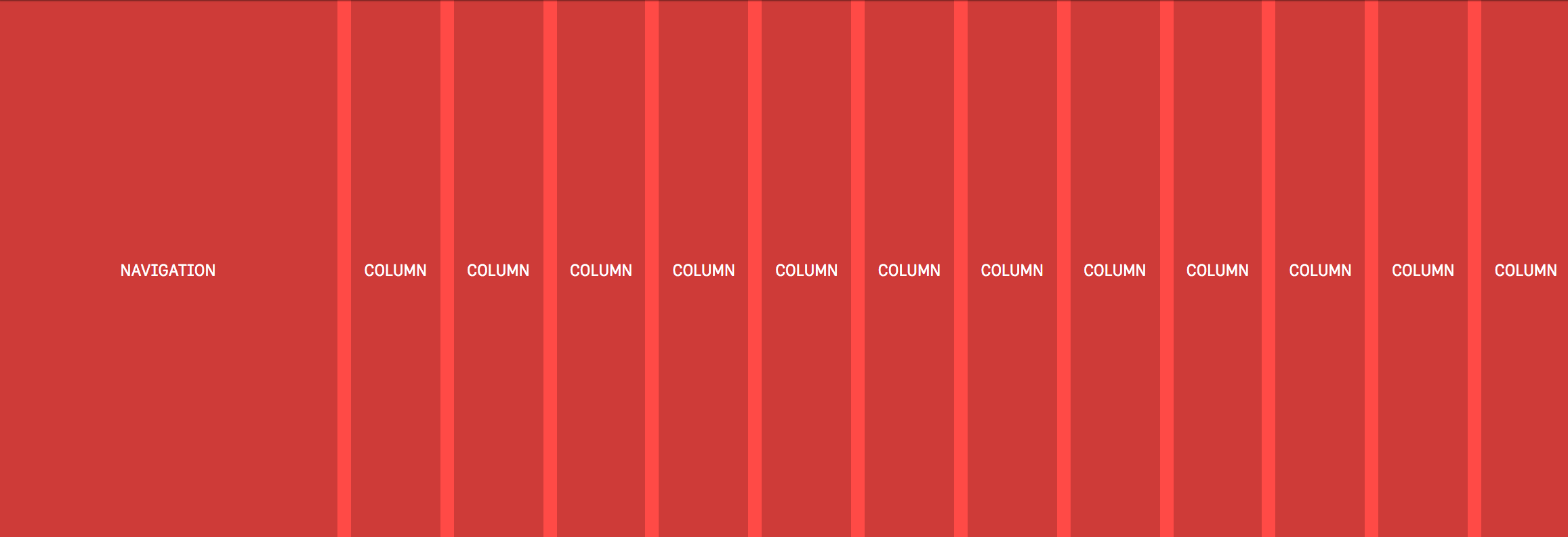
That will look just the same as the example above because in this instance we’re setting each of our four columns to one fraction (which happens to be 1/4 or 25%). But! There’s no overflow on the x-axis anymore because setting each column to 1fr takes that 10px into account automatically and subtracts it from the total width available for each column. Why the heck should I learn how to use this fancy new CSS length if I can mostly stick to the units like percent or pixels, you wonder? Well, let’s dig into a more complex CSS Grid example to explain why fr is a better alternative. In a new example, let’s say we want our navigation on the left followed by a twelve column grid which should look like this: This is a pretty typical scenario for a lot of UIs and so using the fr unit prevents us from either making a separate grid div or fumbling about with calc. Because if we didn’t use fr in the example above then we’d somehow have to figure out the following:
the width of each column = ((width of viewport - width of nav) / number of columns) * 1%
That’s possible for sure, it’s just awfully painful to read, and if we changed the width of the nav then we’d have to do that dumb calculation all over again. Instead, the fr unit tidies all of that up into a super readable line of code:
What we’re doing here is setting a fixed width in pixels for the first column and then creating twelve separate columns which are set at one “fraction of the free space” (literally how the spec phrases it). But there’s no crazy calculations or anything! It’s super readable and if the width of that left nav changes then the width of our columns on the right will adjust themselves automatically. With just a little bit of legwork we’ve made our interface more maintainable for the future and we’ve ensured that our code is more legible for the next developers that are coming up behind us.
Information from other folks
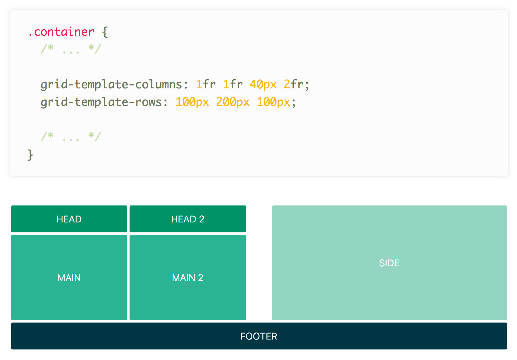
Some of the fun and power of the fr unit comes from mixing it with other units. Imagine a fixed sidebar and main content area that takes up the rest of the space: grid-template-columns: 200px 1fr; easy! Here’s an example from DigitalOcean showing mixed units nicely: Rachel Andrew has a video specifically about fr: Anna Monus has a very good article on fr. Yay for the fr unit!
I believe every front-end developer should know how to use container queries, create a scroll snap experience, avoid position: absolute with grid, swiftly hammer out a circle, use cascade layers, and reach more with less via logical properties. Here’s a quick overview of each of those expectations.
Well orchestrated scroll experiences set your experience apart from the rest, and scroll snap is the perfect way to match system scroll UX while providing meaningful stopping points.
.snaps{ overflow-x: scroll; scroll-snap-type: x mandatory; overscroll-behavior-x: contain; }
Then, in some entirely different file, loaded at some other random time, append a new variant to the button layer as if it was there with the rest of them this whole time.
In web development, especially for smaller sites, organizing CSS styles may seem trivial. However, as projects scale and become more complex, effective CSS organization becomes crucial. It not only influences the speed of development but also impacts the maintainability of code and the overall performance of web applications. This challenge is exacerbated in larger teams where collaboration is key and in long-term projects that might involve legacy code. To address these concerns, various methodologies have emerged, with BEM (Block, Element, Modifier) being one of the most effective for maintaining clarity and structure in CSS.
Methodologies in CSS
Several methodologies aim to streamline CSS management, particularly in large projects. Some notable approaches include:
OOCSS (Object-Oriented CSS): This methodology emphasizes the separation of structure and skin, focusing on reusability by creating objects that can be styled independently.
SMACSS (Scalable and Modular Architecture for CSS): SMACSS categorizes styles into five different types, encouraging a systematic approach to writing CSS that is modular and scalable.
SUITCSS: This approach emphasizes structured naming conventions for class names and clear relationships among styles.
Atomic CSS: It breaks styles into the smallest possible components, promoting high reusability and efficiency.
Among these methodologies, BEM stands out due to its simplicity and effectiveness in fostering a clear understanding of component relationships within the markup.
BEM: Blocks, Elements, and Modifiers
BEM consists of three main components: Blocks, Elements, and Modifiers.
Block: This is a standalone entity that represents a meaningful component of the UI. Examples include header, menu, and form.
Element: An element is a part of a block that does not hold meaning on its own but is semantically linked to its block. For instance, menu__item or form__input.
Modifier: A modifier is a flag that alters the appearance or behavior of a block or element. For instance, button--disabled or card--highlighted.
This structured naming convention allows developers to quickly grasp the relationship between HTML and CSS, enabling easier navigation and understanding of styles.
Implementing BEM
To illustrate how BEM works, let’s consider a button example:
Modularity: Styles defined within a block are independent of other styles, preventing conflicts that arise from CSS cascading. This independence allows for blocks to be reused across different projects without modification.
Reusability: By constructing independent blocks and using modifiers, developers can mix and match styles, significantly reducing the volume of CSS code that needs to be maintained. This leads to a more efficient development process and easier updates in the future.
Structured Code: The clear structure provided by BEM enhances code readability and maintainability. It becomes easier for team members to navigate and understand styles, improving collaboration.
BEM in Practice
When employing BEM, developers gain a predictable structure that enhances team communication. Each component is self-describing, meaning that even without extensive CSS knowledge, a developer can infer the function of various classes. This shared language fosters collaboration and reduces the onboarding time for new team members.
Moreover, BEM addresses the issue of specificity in CSS. By adhering to its principles, developers avoid deeply nested selectors that complicate stylesheets. Instead, they can maintain a flatter specificity, which simplifies overriding styles when necessary.
Challenges and Criticism
While BEM offers many benefits, it is not without criticism. Some developers find the double underscores and double dashes cumbersome, preferring alternative naming conventions. Others argue that the verbosity of class names can lead to bloated HTML and CSS files.
Furthermore, some practitioners argue that adhering strictly to BEM can stifle creativity or flexibility in design. However, these concerns often stem from misunderstandings about the methodology itself. BEM is intended to provide a framework, not a rigid set of rules that must be followed at all costs.
Conclusion
In summary, BEM is a powerful methodology for organizing CSS that fosters clarity, modularity, and collaboration. By clearly defining blocks, elements, and modifiers, BEM helps developers understand the relationships within their code, which is crucial for maintaining large and complex stylesheets. While it may not resolve every challenge in CSS development, it provides a solid foundation for creating scalable, maintainable, and efficient styles. As web development continues to evolve, adopting methodologies like BEM can significantly enhance the development process, ensuring that teams can work effectively and efficiently together.
For those of you who are just looking to copy/paste click on the the complete code or scroll to the bottom of the article…whichever is faster o_O So here is the problem, currently I’m running Prestashop 1.6.1.6 in one of my client’s websites and they ask me to make some modifications to the login admin page. The login admin page is the one we use to login to the back-end of your Prestashop installation. So in my mind, this was easy all I need to do was to find the login admin template override it and apply the needed modifications; yes and no. The first thing I did was to find the template files for the login admin page located at /_ADMIN_DIR_/themes/default/template/controllers/login/. In this folder you will find 4 files (3 files really since we don’t care about the index.php):
content.tpl
header.tpl
layout.tpl
index.php(This one we don’t care about)
In Prestashop version 1.6.1.6 you can override the content of the login admin page, but you CANNOT override the header of login admin page, sigh. Meaning, we can override the content.tpl file, by making a copy of the file and placing it at /override/controllers/admin/templates/login/ but a copy of the header.tpl won’t update the content of the login admin page. Whatever new content you place into the content.tpl file inside the override folder will be reflected on the login page. Again, we are talking about the login admin page the one you use to access the back-end of your website NOT the one your customers use to place orders. So to the get the ball rolling and if you are new to the overriding process, please follow the instructions step…by step.
Override AdminControllerCore class located in root/classes/controller/AdminController.php
Find and override the display method — public function display()
Now you can override your header.tpl located in the root/_ADMIN_DIR_/themes/default/template/controllers/login/header.tpl
1
First step is to locate the public function display() in the AdminController
For those of you who are a little curious you can see that the footer and modules have the same problem as the header. Here it is, this is the final version of AdminController file located at
<?php
/**
* 2007-2016 PrestaShop
*
* NOTICE OF LICENSE
*
* This source file is subject to the Open Software License (OSL 3.0)
* that is bundled with this package in the file LICENSE.txt.
* It is also available through the world-wide-web at this URL:
* http://opensource.org/licenses/osl-3.0.php
* If you did not receive a copy of the license and are unable to
* obtain it through the world-wide-web, please send an email
* to [email protected] so we can send you a copy immediately.
*
* DISCLAIMER
*
* Do not edit or add to this file if you wish to upgrade PrestaShop to newer
* versions in the future. If you wish to customize PrestaShop for your
* needs please refer to http://www.prestashop.com for more information.
*
* @author PrestaShop SA <[email protected]>
* @copyright 2007-2016 PrestaShop SA
* @license http://opensource.org/licenses/osl-3.0.php Open Software License (OSL 3.0)
* International Registered Trademark & Property of PrestaShop SA
*/
class AdminController extends AdminControllerCore{
/**
* @return void
* @throws Exception
* @throws SmartyException
*/
public function display(){
$this->context->smarty->assign(array(
'display_header' => $this->display_header,
'display_header_javascript'=> $this->display_header_javascript,
'display_footer' => $this->display_footer,
'js_def' => Media::getJsDef(),
));
// Use page title from meta_title if it has been set else from the breadcrumbs array
if (!$this->meta_title) {
$this->meta_title = $this->toolbar_title;
}
if (is_array($this->meta_title)) {
$this->meta_title = strip_tags(implode(' '.Configuration::get('PS_NAVIGATION_PIPE').' ', $this->meta_title));
}
$this->context->smarty->assign('meta_title', $this->meta_title);
$template_dirs = $this->context->smarty->getTemplateDir();
//print_r($this->context->smarty->template_dir);
// Check if header/footer have been overriden
$dir = $this->context->smarty->getTemplateDir(1).DIRECTORY_SEPARATOR.trim($this->override_folder, '\\/').DIRECTORY_SEPARATOR;
$dir_core = $this->context->smarty->getTemplateDir(0) .'controllers'.DIRECTORY_SEPARATOR.trim($this->override_folder, '\\/').DIRECTORY_SEPARATOR;

if(file_exists($dir.'header.tpl')){
    $header_tpl = $dir.'header.tpl';
}elseif(file_exists($dir_core.'header.tpl')){
    $header_tpl = $dir_core.'header.tpl';
}else{
   $header_tpl = 'header.tpl';
}
$module_list_dir = $this->context->smarty->getTemplateDir(1).DIRECTORY_SEPARATOR.'modules_list'.DIRECTORY_SEPARATOR;
$module_list_dir_core = $this->context->smarty->getTemplateDir(0).'helpers'.DIRECTORY_SEPARATOR.'modules_list'.DIRECTORY_SEPARATOR;
//$header_tpl = file_exists($dir.'header.tpl') ? $dir.'header.tpl' : 'header.tpl';
//print_r($module_list_dir);
if(file_exists($dir.'footer.tpl')){
$footer_tpl = $dir.'footer.tpl';
}elseif(file_exists($dir_core.'footer.tpl')){
$footer_tpl = $dir_core.'footer.tpl';
}else{
$footer_tpl = 'footer.tpl';
}
//$footer_tpl = file_exists($dir.'footer.tpl') ? $dir.'footer.tpl' : 'footer.tpl';
if(file_exists($module_list_dir.'modal.tpl')){
$modal_module_list = $module_list_dir.'modal.tpl';
}elseif(file_exists($module_list_dir_core.'modal.tpl')){
$modal_module_list = $module_list_dir_core.'modal.tpl';
}else{
$modal_module_list = 'modal.tpl';
}
// $modal_module_list = file_exists($module_list_dir.'modal.tpl') ? $module_list_dir.'modal.tpl' : 'modal.tpl';
$page_header_toolbar = file_exists($dir.'page_header_toolbar.tpl') ? $dir.'page_header_toolbar.tpl' : 'page_header_toolbar.tpl';
$tpl_action = $this->tpl_folder.$this->display.'.tpl';
// Check if action template has been overriden
foreach ($template_dirs as $template_dir) {
if (file_exists($template_dir.DIRECTORY_SEPARATOR.$tpl_action) && $this->display != 'view' && $this->display != 'options') {
if (method_exists($this, $this->display.Tools::toCamelCase($this->className))) {
$this->{$this->display.Tools::toCamelCase($this->className)}();
}
$this->context->smarty->assign('content', $this->context->smarty->fetch($tpl_action));
break;
}
}
if (!$this->ajax) {
$template = $this->createTemplate($this->template);
$page = $template->fetch();
} else {
$page = $this->content;
}
if ($conf = Tools::getValue('conf')) {
$this->context->smarty->assign('conf', $this->json ? Tools::jsonEncode($this->_conf[(int)$conf]) : $this->_conf[(int)$conf]);
}
foreach (array('errors', 'warnings', 'informations', 'confirmations') as $type) {
if (!is_array($this->$type)) {
$this->$type = (array)$this->$type;
}
$this->context->smarty->assign($type, $this->json ? Tools::jsonEncode(array_unique($this->$type)) : array_unique($this->$type));
}
if ($this->show_page_header_toolbar && !$this->lite_display) {
$this->context->smarty->assign(
array(
'page_header_toolbar' => $this->context->smarty->fetch($page_header_toolbar),
'modal_module_list' => $this->context->smarty->fetch($modal_module_list),
)
);
}
$this->context->smarty->assign(
array(
'page' => $this->json ? Tools::jsonEncode($page) : $page,
'header' => $this->context->smarty->fetch($header_tpl),
'footer' => $this->context->smarty->fetch($footer_tpl),
)
);
$this->smartyOutputContent($this->layout);
}
}
This app takes hands-free 360-degree panoramic photos. To do this, the app depends on the iPhone 5’s flat ends to stand up. Vibrations created by the haptic engine rotate the device, while the camera captures the surrounding environment. The result is a perfect panoramic photo. Even more innovative is Cycloramic’s solution for the round-edged iPhone 6, which cannot stand on its end. The app’s creators use an additional material, the charging plug, as a holder for the phone. Good apps leverage the technologies made available by the device that they’re designed for. The new Apple Watch could lead to a whole new gold rush in the app market. Like homeowners of the Victorian era, companies will create watch apps just to keep up with the Joneses. These apps might not even serve a defined purpose. The successful and well-designed apps will leverage the watch’s core technologies, such as the taptic engine, NFC reader, heart-rate monitor and input crown. How will you leverage the technologies available on the devices you’re designing for?
For the last couple of weeks, I have been working on a theme using WordPress, Genesis and Foundation Zurb. Foundation is a front-end framework for rapid prototyping. Meaning? It is a large array of tools that make most of look that much cooler and way faster to code. However, mixing these 3 awesome tools into one single project didn’t come without its headaches. One of the major problems I have encountered so far is to be able to match preexisting CSS styles in Foundation with WordPress. I could go about it in in two different ways. First, by using WordPress filters which will get cumbersome really quickly, as you would need to write functions to modify class names for each and every HTML element I target in my project. However, if you decide to go this route despite to be time consuming, I would need to also be aware that for some HTML elements there are no filters available. Meaning? you won’t be able to edit those elements, directly as of WordPress core developers didn’t see the need for users to be able to customize those elements to that extend. Take for example the comment submit button:
At the time of this writing, there is no available filter to modify the class attribute for the comment submit button. There are ways around it, though. For example, adding a custom submit button and hiding the original WordPress button using CSS. However, this enters in the realm of hacking WordPress more than anything else, so I won’t be covering it in this post. While doing research on this topic, I found a ticket for WordPress core developers working on the comment button issue. This ticket was finally closed 3 months ago and it only took them 3 years, to come to a solution YAY!. However, the concept behind the issue was somehow lost during the entire process. The WordPress core developers added a class named “submit” to the button and no way for users to customize the class name; so the problem still remains.
OOCSS and the Comment Submit Button
Styling the comment button using its class name as opposed to its ID allows front-end developers to separate content from its container which is one of basic principles of OOCSS. This is kind of the way front-end developers are going right now. However, this is an Issue that WordPress don’t seem too concerned about. Take for example that submit button inside the comment section. According with WordPress core developers if we choose to style that specific button, well, we will need to use its ID:
But, what happens if we need another identical looking button somewhere else in the page? Well, according to WordPress you just need to target that button by its ID, as well:
Here, we have redundant code that will contribute to having a final “bloated” CSS file. How could fix this? The first step would be to replace the ID selectors for class names, which will allow us to create reusable code throughout our project. Secondly, separating structure, skin and content.
and this is how we will apply these class selectors if we would have had access to customize the class name for the comment submit button in our WordPress project:
Now, Foundation comes with several classes that deal with buttons. The most basic of these selectors is the “button” class. All you need to do is match the style selector to the CSS class of the button. However, like we have already discussed, there is no way to accomplished this using WordPress’ existing filters. WordPress developers chose to call the class name for the submit button, “submit.” If we want to match the selector class “.button” from Foundation with WordPress’ “submit” button, we will need the help from SASS. Yes, SASS is awesome and if you are not familiar with SASS I would suggest to read about it and incorporate it in your future projects. For our present problem, it is actually very simple since Foundation comes prepackaged with SASS.
The Solution for the Comment Summit Button
SASS @extend directive works amazingly well in this case. Let’s say for example, we want to style our “submit” button with the default look and feel from Foundation, then all we need to to is “extend” the button class in our SCSS file:
#submit{
  @extend .button;
}
After the file is compiled, the final CSS file should look something like this.
#submit,.button{
   ...
}
SASS’ @extend directive will automatically apply that ID “#submit” anywhere the class “.button” is. Meaning? “#submit” and “.button” are now one and the same, as “#submit” is an extension of the button class. If you choose to use the custom button we created previously. We need to extend three different classes in this case.
What if the footer-button needs a red button instead of a blue one, or an larger size? In that case, we will need to create the style rules for just the attributes that we are looking to change.
What if we need a medium blue button, next? or a small red button? All we need to do is to extend the proper classes without having to modify the original classes for each and every button we create; reusable code.
This little plugin that I’m currently using along with my Sublime Text editor for Window is called EMMET. It has cut in half the amount time it takes me to code HTML & CSS. It comes with a large number of coding features and shortcuts but when you combine that with a “Lorem Ipsum” generator, it makes this a great design tool. I could spend several articles explaining in detail all of EMMET’s features so I’m just going to focus on the “Lorem Ipsum” Generator.
What is “Lorem Ipsum?”
Chances are that if you are a web developer, you are already familiar with “Lorem ipsum.” This dummy text is often used to test user interfaces by displaying real data.
Lorem ipsum dolor sit amet, consectetur adipisicing elit. Laborum, nemo quaerat molestias delectus laudantium perferendis, voluptate sit necessitatibus fuga, cum recusandae maxime, repellendus facere natus commodi. Possimus deserunt perferendis dolorum molestiae modi similique, enim, rerum, quod inventore ratione eveniet fugiat at incidunt aspernatur ipsam et.
“Lorem Ipsum” Generator
Now what to do with it? If you are currently using Sublime Text editor and Emmet you can start by typing the keyword “lorem” followed by the length of the string you are looking insert within your file:
lorem20
Lorem ipsum dolor sit amet, consectetur adipisicing elit. Distinctio unde ratione atque nisi odit facilis velit ab incidunt delectus, illum.
The previous code will generate a Lorem string with length of 20 words. With the help of EMMET, you could create more complex strings of HTML.
ul>li>lorem25
Lorem ipsum dolor sit amet, consectetur adipisicing elit. Libero error molestias nostrum quam excepturi, autem id eos porro. Ex, quibusdam itaque ad neque voluptatem at.
This is a unordered list with one list item and a “Lorem Ipsum” string of length 25. There is no limit on how complex these statements can be.
You could add the following code to your Apache config file inside of <IfModule mime_module> tag: AddType application/x-httpd-php5 .html .htmIf you need to support other file types, like “..xml”, simply add them to the list, like this:AddType application/x-httpd-php5 .html.xml The entire text should look like this. <IfModule mime_module>
AddType application/x-httpd-php .php
</IfModule> Also, you could add the same line of code, anywhere inside your .htaccess file.
This was frustrating until I realized some of the configuration options I have been using for so long when configuring a virtual host in my local machine have been deprecated. Adding one line of code did the trick – Require all granted This is what I used to use:
<Directory "/websites/httpdocs/dummmy-website">
Options Indexes FollowSymLinks
AllowOverride All
Order allow,deny
Allow from all
</Directory>
And this is what I’m using now.
<Directory "/websites/httpdocs/eOpiates/website-dynamic/">
Options Indexes FollowSymLinks
AllowOverride All
Order allow,deny
Allow from all
Require all granted
</Directory>